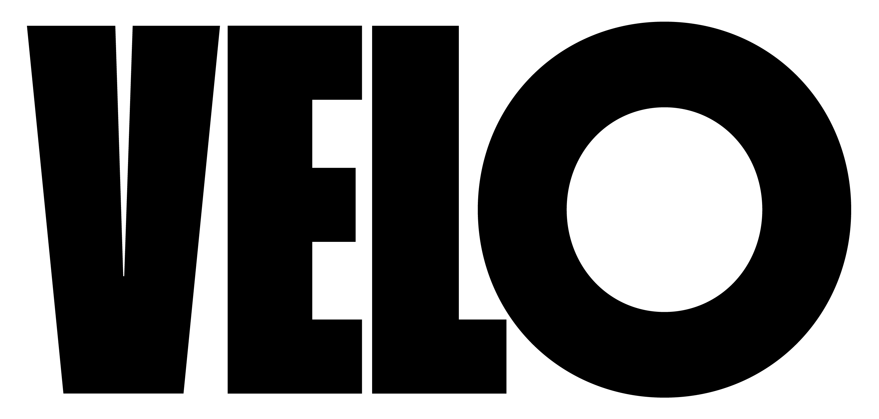
Velo takes its name and spirit from the bold, uncompromising lettering of 60s and 70s editorial design and early cycling posters, where space was precious and impact was everything.
Compressed grotesques from the late 1800s solved a practical problem – fitting maximum message into minimum width – but their dense, geometric forms also possessed a graphic power that later generations would fully exploit. Most notably, Willy Fleckhaus transformed Schmalfette Grotesk (Walter Haettenschweiler, 1954) into a defining element of Twen magazine's radical layouts from 1959 to 1971, setting bold type white-on-black against graphic photography that redefined editorial design.
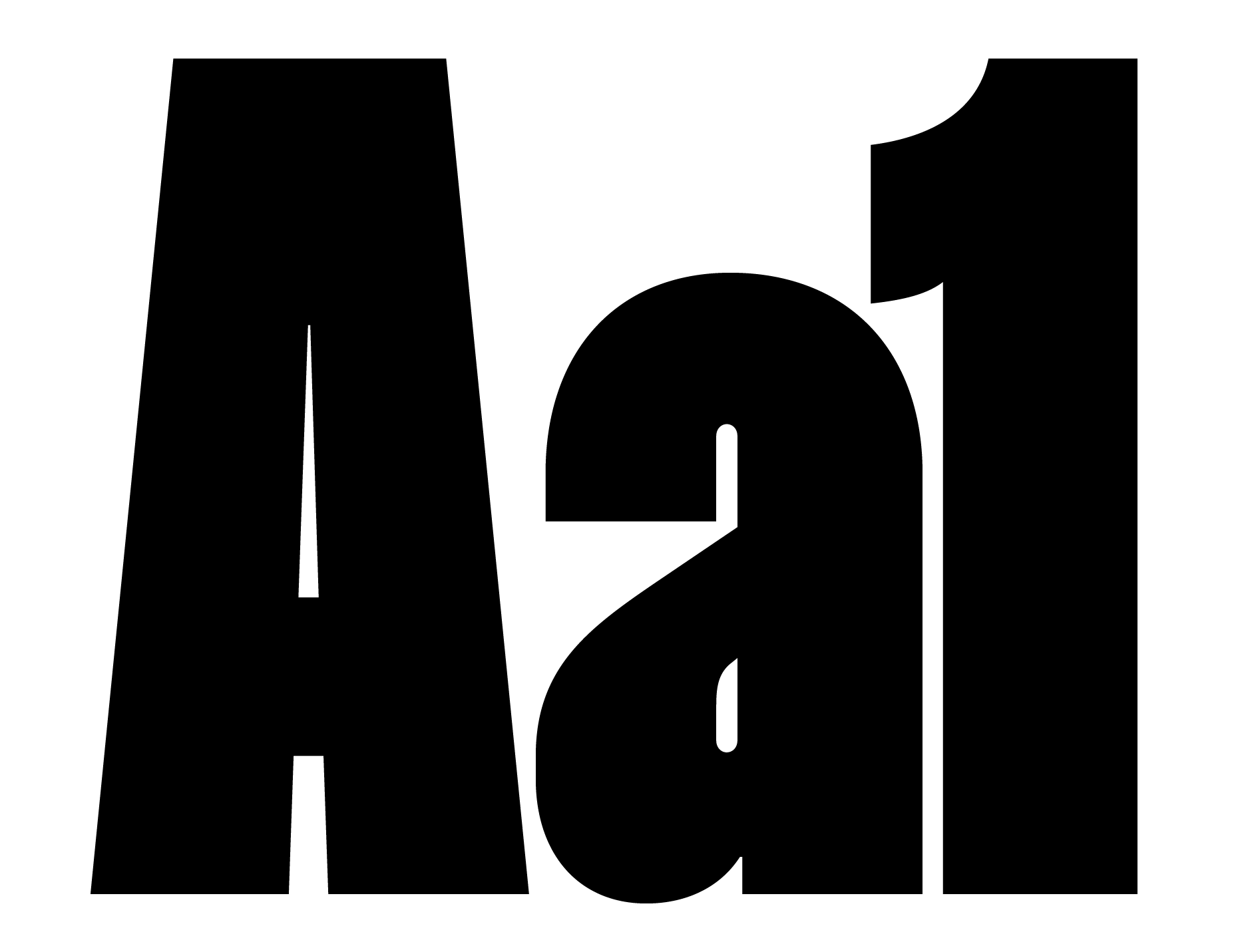
Velo builds on this tradition with intentionally minimal optical correction at stroke intersections, creating a modular, mechanical quality that feels both engineered and expressive. The typeface is distinguished by its circular 'O' forms that exaggerate the compressed proportions, along with a set of delicate hairline symbols that provide textural contrast.
Available in ten weights with multiple OpenType alternates, Velo offers designers a versatile tool for bold editorial design, posters, and any application where presence is non-negotiable.
Designed by: Hugh Morse
Year: 2025
Glyphs: 1,140
Encoding: Latin Extended
File Formats: OTF, WOFF, WOFF2
Version: 1.0
Anquetil (1960) Taccone (1961) Balmamion (1962) Balmamion (1963) Anquetil (1964) Adorni (1965) Dancelli (1966) Gimondi (1967) Merckx (1968)
Pivot 340°
1973 Classic
1973 Classic
NO/YES
Animal
(20%)
(20%)
Machine
(79%)
(79%)
[3×] Speed
nous découvrons que la créativité émerge de l'éQuilibre délicat entre structure et spontanéité
The creative mind requires both freedom and constraint, working within established patterns while discovering new possibilities for expression and understanding.
The path to understanding comes through direct experience, not through conversation alone. We must recognize that while the world appears chaotic, patterns emerge naturally through careful observation and thoughtful design. As creators and makers, we have the power to shape these patterns, to find meaning in complexity, and to build tools that transform how humans interact with their environment. The process requires both freedom and constraint, working within established forms while discovering new possibilities. Through this delicate balance of order and creativity, structure and spontaneity, we begin to see that everything is already connected - we simply need to reveal the inherent relationships.
The path to understanding comes through direct experience, not through conversation alone. We must recognize that while the world appears chaotic, patterns emerge naturally through careful observation and thoughtful design. As creators and makers, we have the power to shape these patterns, to find meaning in complexity, and to build tools that transform how humans interact with their environment. The process requires both freedom and constraint, working within established forms while discovering new possibilities. Through this delicate balance of order and creativity, structure and spontaneity, we begin to see that everything is already connected - we simply need to reveal the inherent relationships.
The path to understanding comes through direct experience, not through conversation alone. We must recognize that while the world appears chaotic, patterns emerge naturally through careful observation and thoughtful design. As creators and makers, we have the power to shape these patterns, to find meaning in complexity, and to build tools that transform how humans interact with their environment. The process requires both freedom and constraint, working within established forms while discovering new possibilities. Through this delicate balance of order and creativity, structure and spontaneity, we begin to see that everything is already connected - we simply need to reveal the inherent relationships.